
My Front cover mostly conforms to the conventions of real media products, the feature article is centre stage with the head of the main artist slightly covering the D in "Kord". The sell lines for the magazine are in space in the top right side of the magazine cover and the bottom left with the main artist's sell line going across the centre of the page. In my front cover I decided to copy the set out of "Q" magazine  . The website of the magazine is set right above the masthead this challenges the conventions of a music magazine as websites are normally situated at the bottom of the page. However with the slogan being under the masthead this conforms to the conventions of real media products .
 . The website of the magazine is set right above the masthead this challenges the conventions of a music magazine as websites are normally situated at the bottom of the page. However with the slogan being under the masthead this conforms to the conventions of real media products .
Contents Page


With my contents page I decided to copy from an isuue of "Q". Again my contents page mostly challenges the conventions of a real media product, the website, page number, issue number and magazine masthead are at the bottom of the page which is conforming to real media products. My contents page which has been created over two pages shows clear indication to the readers what stories are on what pages. Like in real media products my contents page shows refference to, subscription, competitions, live performances/giggs and reviews on albums.
Double Page Spread
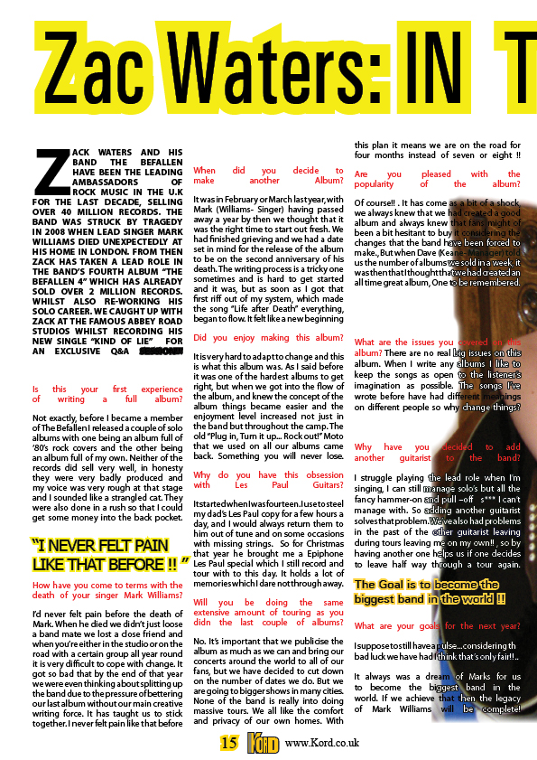

My double page spread again conforms to the conventions of a real media product. My double page spread article is in the form of a question and answer. At the bottom of the page there is a reference to the website aswell as the page number as well as the magazine masthead. The tittle of the article is in bold letters and goes acoss the both pages. My opening paragraph conforms to the convetions of real media products as it is in bold captial letters with the first letter being taller in height than the rest. Like in real media products the use off pull-quotes is important, in my article I have used two pull quotes trying to highlight important pieces of the article.


