Thursday 5 May 2011

contents and front cover final attempt


My final attempt at my front cover see's a change in subsidary image. My contents page due to lack of willing models there a elder models suggesting a wider target audience and a different style of music by the way they are dressed
I used these two photos to be more in-keeping with the target audience I first set, The leather gloves that the lead singer is wearing suggest that the genre of music is hard rock/heavy metal

Monday 2 May 2011

Question 7. Looking back at your perliminary task, what do you feel you have learnt in the progression from it to the ful product ?


From the preliminary task of the school magazine front cover I have learnt that the positioning and layout of the main picture is important to how the rest of the magazine is going to be layed out. For example on my school magaine my subsidiary image and sell lines are very squashed in as I didn't leave enough space around the photo, to create this space on the music magazine I remove the background. On my music magazine I also remebered to put on the basics such as slogan, date and issue number and made sure that everything was clear to stand out especailly the Masthead "Kord" . Overall I was happy the way that my music product transformed from my preliminary task and I'm pleased with my colourscheme for the writing of black and gold which is the only thing that I kept from the preliminary task, and I'm pleased that I've created an original design following the codes and conventions of a real media product.

Question 6. What have you learnt about technologies from the process of constructing thi product?

To create my product I used Adobe in Design which is a desktop publishing software.
for many of my pictures I had to remove backgrounds either because they were to dark or because they were of bad quality, for this I had to use coral paint shop pro.
Research of media products was done on the internet, this research helped me understand the basic conventions and layout of a magazine front cover, contents page and double page spread article.
I captured my images using a digital camera, for this I had to think about the angle from which I took the photo from, If I needed to use the flash on the camera, and what lighting was suitable to use e.g Natural light, multi  spot lights.

Question 5. How did you attract/ address your audience?

The way that my soeaks to the audience is an essential part of appealing to the target audience. By doing a question and answer format for my article I tried to get the character to talk to the audience, making more emotion show through than you would get if the article wasn't in a Q&A format. Through out the article there were not many times where derogatory language was used aiming at maybe an older target audience. In my media product I have also made it friendly towards the audience incouraging them to enter competitions to win prizes such as signed cd or drum sticks

Question 4 . Who would be the audience be for your meida product?

Kord magazine aims to target a prdominately male audience of around 70-75%, this audience are generally around the 15-25 years, these are normally studying in school, college or univeristy. People who would buy this magazine would be very heavy consumers of rock and metal music, who would be more interested in collecting albums rather than downloading them, and go to giggs regularly. Kord magazine focuses on a range of music, with the up and coming bands (especailly guitarists) as well as established bands and solo artists

most magazine titles focus on a predominant male audience which is shown in these figures
Q magazine = 68% male target audience
NME = 65% male target audience
UNCUT = 96% male target audience
the feedback given to my magazine shows that my magazine like Q and Uncut would also target more of a male audience

Question3. What kind of media institution might distribute your media product and why ?

The distributor of magazines have to understand the audience in order to develop ways of increasing sales of the magazine
The magazine distributor that I have studided is a company called Frontline ltd. Frontline distribute over 180 magazines from there partners magazine titles which includes the company Bauer media. These titles include 70 of the top 200 best selling titles in the Uk. Frontline are also the biggest disrtibuting company in the country. My magazine is going to transfer from the publisher to the wholesaler is through a distributer

Publisher - Distributor- Wholesaler- Retailer- Consumer

Question 2. How does your product represent particular social groups?

for my product I have tried to use modles of the age of 16-18 however, these modelswould attract ta target audience of the same age. However due to the lack of willing models I was forced to use older models for a couple of pictures on my contents page. The models on my pageare completley male models this is so because rock music tends to target a male audience. The character of Zack Waters who is the featured artist is clearly a maistream rock artist who mainly appeals to the male audience as none of the pictures he is seen without a guitar near him, with the guitar being an insrtument mainly played by males. However the male models in thecontents page are seen wearing leather clothing which is stereotypically linked with heavy rock/metal music

question 1. In what ways does your media use, develop or challenge forms and conventions of real media products?

Front Cover
My Front cover mostly conforms to the conventions of real media products, the feature article is centre stage with the head of the main artist slightly covering the D in "Kord". The sell lines for the magazine are in space in the top right side of the magazine cover and the bottom left with the main artist's sell line going across the centre of the page. In my front cover I decided to copy the set out of "Q" magazine . The website of the magazine is set right above the masthead this challenges the conventions of a music magazine as websites are normally situated at the bottom of the page. However with the slogan being under the masthead this conforms to the conventions of real media products .


Contents Page
With my contents page I decided to copy from an isuue of "Q". Again my contents page mostly challenges the conventions of a real media product, the website, page number, issue number and magazine masthead are at the bottom of the page which is conforming to real media products. My contents page which has been created over two pages shows clear indication to the readers what stories are on what pages. Like in real media products my contents page shows refference to, subscription, competitions, live performances/giggs and reviews on albums.

Double Page Spread
My double page spread again conforms to the conventions of a real media product. My double page spread article is in the form of a question and answer. At the bottom of the page there is a reference to the website aswell as the page number as well as the magazine masthead. The tittle of the article is in bold letters and goes acoss the both pages. My opening paragraph conforms to the convetions of real media products as it is in bold captial letters with the first letter being taller in height than the rest. Like in real media products the use off pull-quotes is important, in my article I have used two pull quotes trying to highlight important pieces of the article. 


Wednesday 27 April 2011

double page spread final attempt


In my final attempt it was decided that my Image used in the first two drafts was two similar to the image used for the front cover of the magazine, where I decided to remove the background the image didn't stand out to the reader, my new image of my model sitting on a bench with a black acoustic guitar in his hand overlaps the left hand page slightly, however to try and restrain the amount of colours on the background I decided to remove the top half of the background, this creates a good effect two the articel , The writing towards the far side of the left hand side of the article is in a white font with a black outline to make it stand out against the dark background image.

Tuesday 15 March 2011

Content/ double page spread pictures

For this picture I took inspiration from a picture in a special edition of Classic Rock

Friday 18 February 2011

Double page spread attempt 2


Double page spread 1st attempt


Double page spread, rough draft

My first draft of my double page spread I took inspiration yet again from a special edition of classic rock magazine, where the image is on the left hand page and the Q&A section to the right hand page with a "Essentials" box informing the reader what they need to know about the certain artist. The information includes when the artist was born, what guitars they used and a classic albums section

Saturday 1 January 2011

Main article

My main article is going to be in the struture of a Question and Answer. With Questions asking the mucisian about.. new album or single, how he became famous, political views, guitars used, tour dates

Main articles that I like


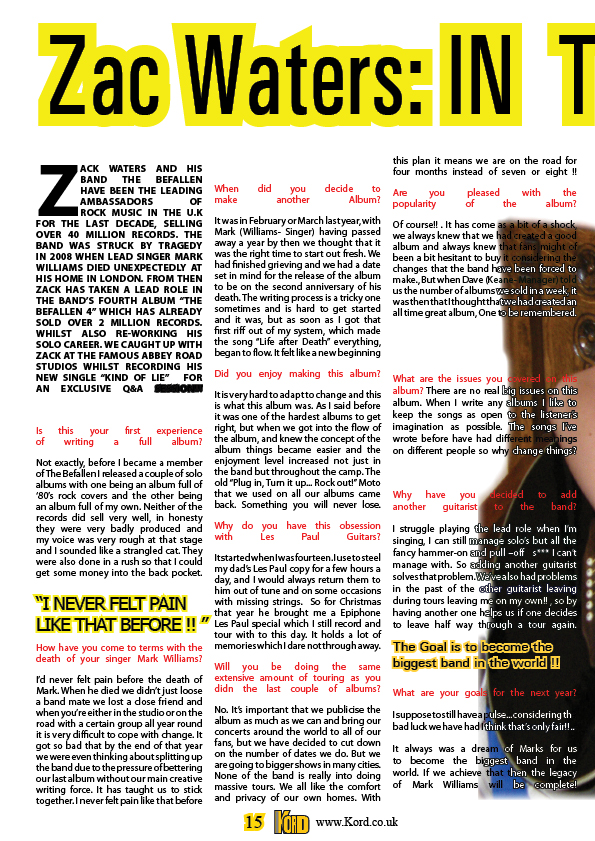
 Both of these articles have information boxes featured on them, this appealed to me as I'm wanting to put an information box in my article. What I like about the bottom article is how the main image and the text overlap, which is another technique which I might like to use on my magazine article.